
Sales Quote System
Designing a responsive web application for streamlined B2B quoting and upselling

Overview Our client provides enterprise solutions to manage and automate services globally. The Sales Quote System, part of their largest sales transformation, is a B2B web app that streamlines pricing and quote creation for inside sales teams, accelerating deal velocity.
What I did
• Created user flows & experience maps
• Wireframed and prototyped key interfaces
• Presented design concepts to product owners and clients
• Wrote test scripts and conducted user testing sessions
• Analyzed testing results and delivered outcome reports • Annotated designs for developer handoff
• Collaborated on building a scalable design system
Client ServiceNow through Avanade
Role Product Designer
Duration 8 months (2020-2021)
Skills & Tools
Wireframing
Usability Testing
Design Systems
Figma
Zeplin
Problem Statement
How might we integrate separate systems into a seamless platform that simplifies pricing and speeds approval for sellers? The Sales Quote System targets complex pricing, approvals, and quote generation, where every moment impacts sales velocity.
Scope
The project focused on driving sales transformation through the new system, guided by regular usability testing and feedback from actual sellers.
Research

Upon joining, we reviewed preliminary personas. The primary users included:
Solution Sales: Supports internal and external customers, driving new business for smaller accounts.
Account Executives: Builds client relationships, recommends products, and meets sales targets.
Process Blueprint
The product process encompasses several key stages, including:

User Flows
We mapped the seller’s end-to-end journey, highlighting key decision points, potential UI screens, and opportunities to add value from quote creation to contract finalization.
Experience Maps
We created a visual map of the end-to-end Software Services process, highlighting key interactions. Focus areas included easy access to user information, clear actionable items, and main content areas: product configuration, deal score, product cart, and quote details.
Design
Previous Existing Designs
We used existing wireframes as a starting point, iterating to identify pain points and creating new versions for user testing based on our insights.
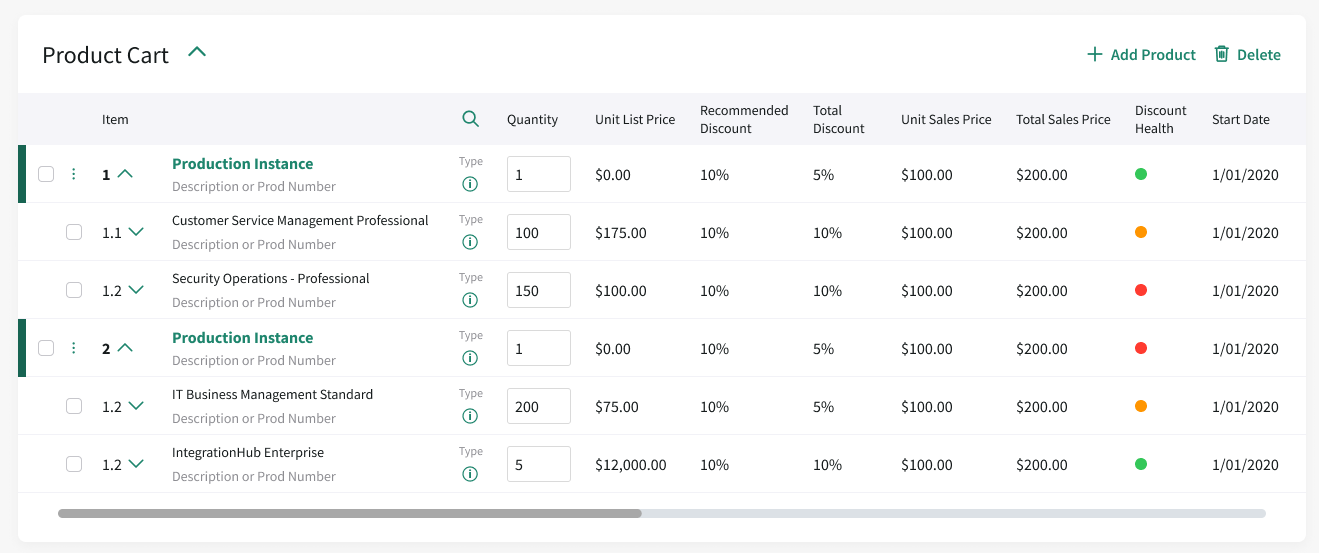
Product Cart
Deal Score
Pain Points & Goals
Data-Heavy Application: Establish a clear hierarchy to highlight the most important content.
Interaction Elements: Ensure intuitive controls for key tasks.
Core Features: Design must address essential user needs.
Information Grouping: Explore whether better grouping improves clarity and usability.
Initial Designs (Deal Score)


We first focused on the deal score, a critical feature that helps sellers quickly assess quote health and identify adjustments to improve it.
Initial Designs (Quote Layout)


We explored ways to organize main content, focusing on section hierarchy and overall layout. Due to the information volume, we chose a vertical dashboard with collapsible sections that adapt to different quoting stages.
Usability Testing
We led user research, conducting seller tests in nearly every sprint. We created study plans and discussion guides, collaborated with product owners and sales insights, and applied UX principles to ensure actionable, user-aligned recommendations.

Types of Tests
Usability Testing: Users complete tasks in realistic scenarios.
Perception Testing: Explore reactions to different design concepts.
Probing: Ask targeted questions to gather insights on behavior and inform the UX/UI.
Test Results
We shared analyzed data with clients, providing UX recommendations and prioritizing features. Stakeholders reviewed and approved proposed changes before design iterations proceeded.

Product Cart Iterations after usability testing
Before finalizing, we iterated on the product cart, improving hierarchy, color, and visual organization to enhance usability and streamline the experience.

Before
After
Final Design for Quote LAyout
The quote layout screen hosts the most interactions; user testing helped us prioritize sections and present key information in a technically feasible way.

New Design Decisions:
Prioritized column headers and established a clear information hierarchy
Defined interaction elements to support actionable tasks
Applied if/then logic to hide or collapse sections by stage, keeping the page organized
Enhanced visual design for clarity and improved user experience
Design System
While following ServiceNow’s brand colors, we defined our own standards for typography, buttons, color usage, and components. Component sheets in Figma allowed easy swapping of instances and states, ensuring consistency across the project.

Final Thoughts
Joining mid-pandemic, I worked in a fully virtual, small agile design team, owning key product areas and leading user research almost every sprint. I regularly validated designs with product owners, ran tests, analyzed results, and presented work to stakeholders.
Key Challenges
Agile Workflow: Frequent rework as functional teams finalized requirements.
Technical Limitations: Some designs were constrained by the software, requiring future adjustments.
Remote Collaboration: Adapting to virtual teamwork while maintaining productivity and communication.