
Baby+ Branding
Rebrand & mobile app integration between two companies
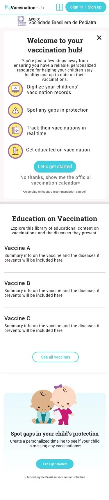
Overview MyVaccinationHub is a responsive web app for parents to track their children’s vaccination timeline and gaps. Philips’ Baby+ app tracks overall baby development, and a strategic partnership between the two could reach 600 million users globally.
What I did
• Created user flows
• Designed the onboarding experience
• Branding & visual design
• Designed marketing ads for the roll out
Company GSK & Philips
Duration 4 months
Role Product Designer
Skills & Tools
Sketch
Invision
Project Background
Problem Statement
How might we create a seamless experience for parents to confidently track their children’s vaccination schedules within the Baby+ app?
Audience
Primary users: mothers aged 32–45.
Secondary users: parents managing childcare alongside household responsibilities.
Scope & Constraints
Design for a WebView to enable quick testing with a subset of users before a full release.
Limited control over design within the Baby+ native app.

Design Process
Onboarding Flow
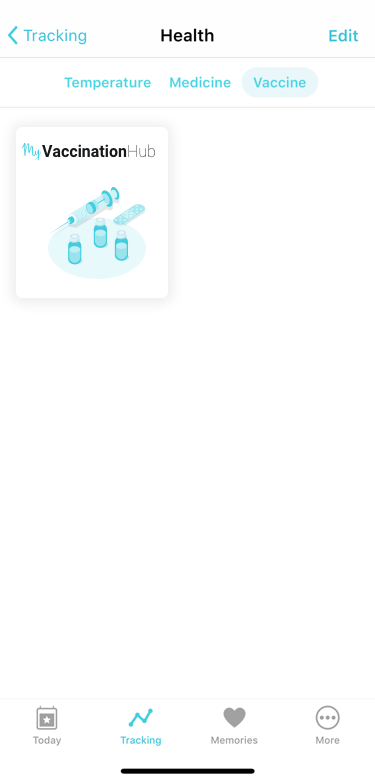
We reviewed the Baby+ app to determine where MyVaccinationHub would fit, then mapped the onboarding flow for new and existing users. This helped prioritize screens for early design and feedback.
Entry Recommendations
Although we couldn’t control entry points in the Baby+ app, we conducted research and suggested UX integration points. The top two options ensure the feature is visible and not nested.


Color Exploration & Accessibility
We showed clients different effort levels to identify the best experience while using Baby+’s color palette.
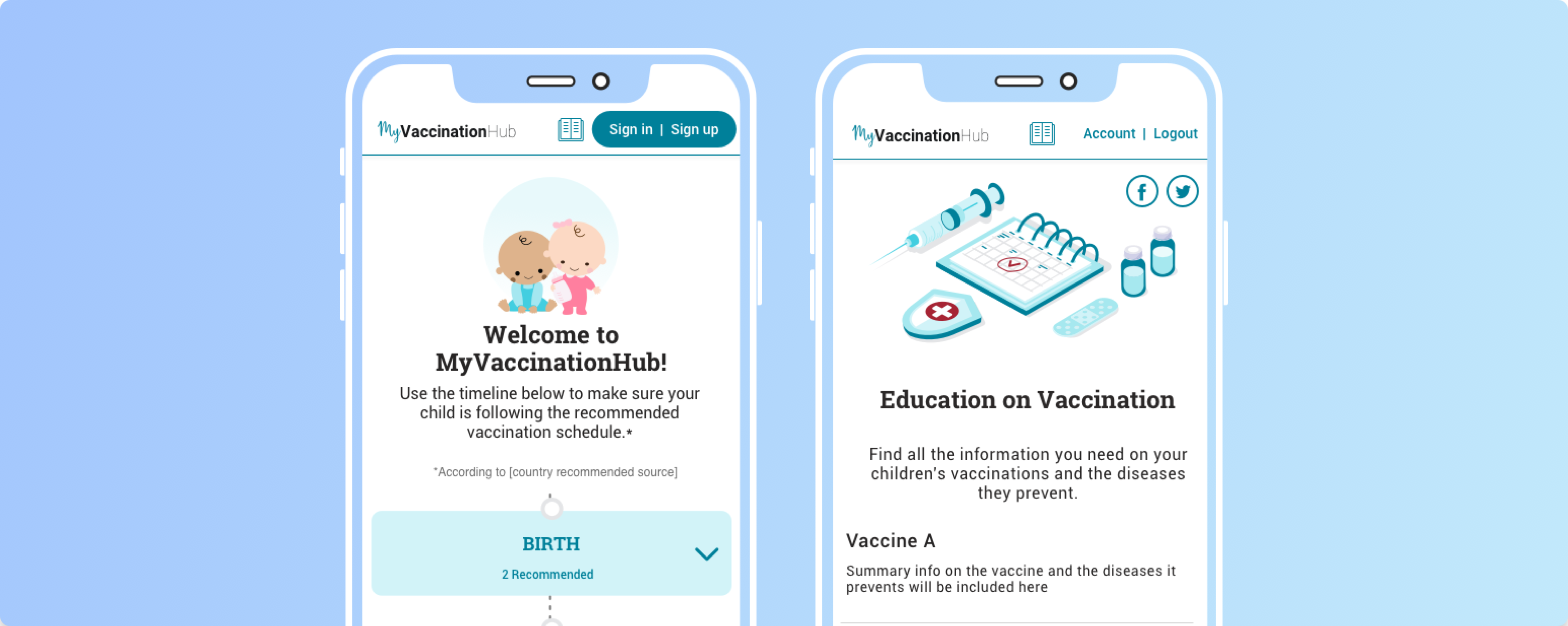
Current Branding: Mobile view (left) and desktop view (right) with the existing MyVaccinationHub colors.
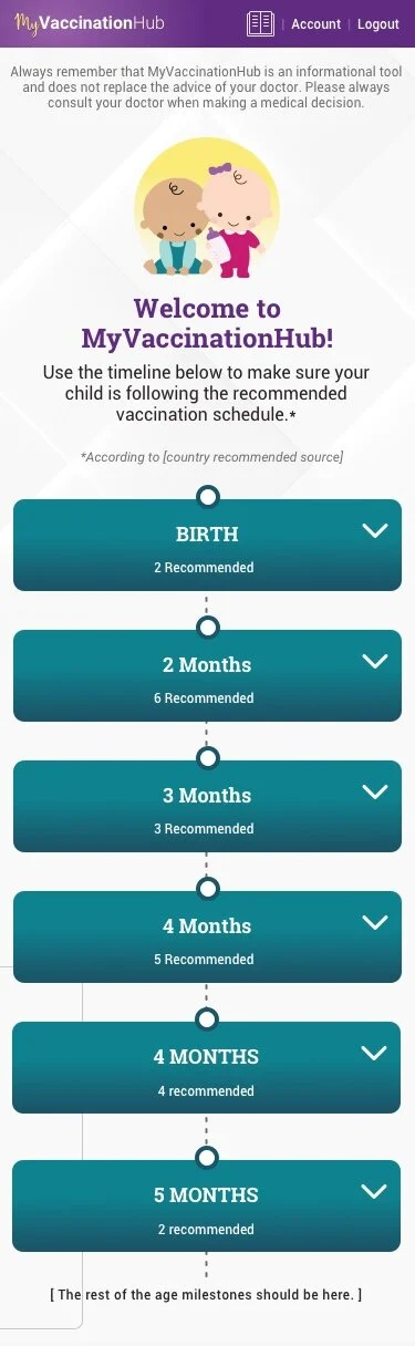


We chose the third option on the far right, prioritizing accessibility over exact color matching to Baby+ while maintaining our own identity. We also adjusted content and button sizes to ensure equal access for all users.
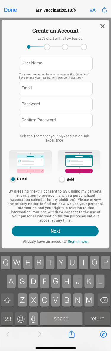
Theme Selector
We track user context with themes: Baby+ users automatically get the “Pastel” theme, while new users can choose their preferred theme during account creation.


Updating Assets
We updated the existing masters by replacing colors, icons, illustrations, banners, timeline, and buttons, and refreshed localization and RAG guidance for the new screens.

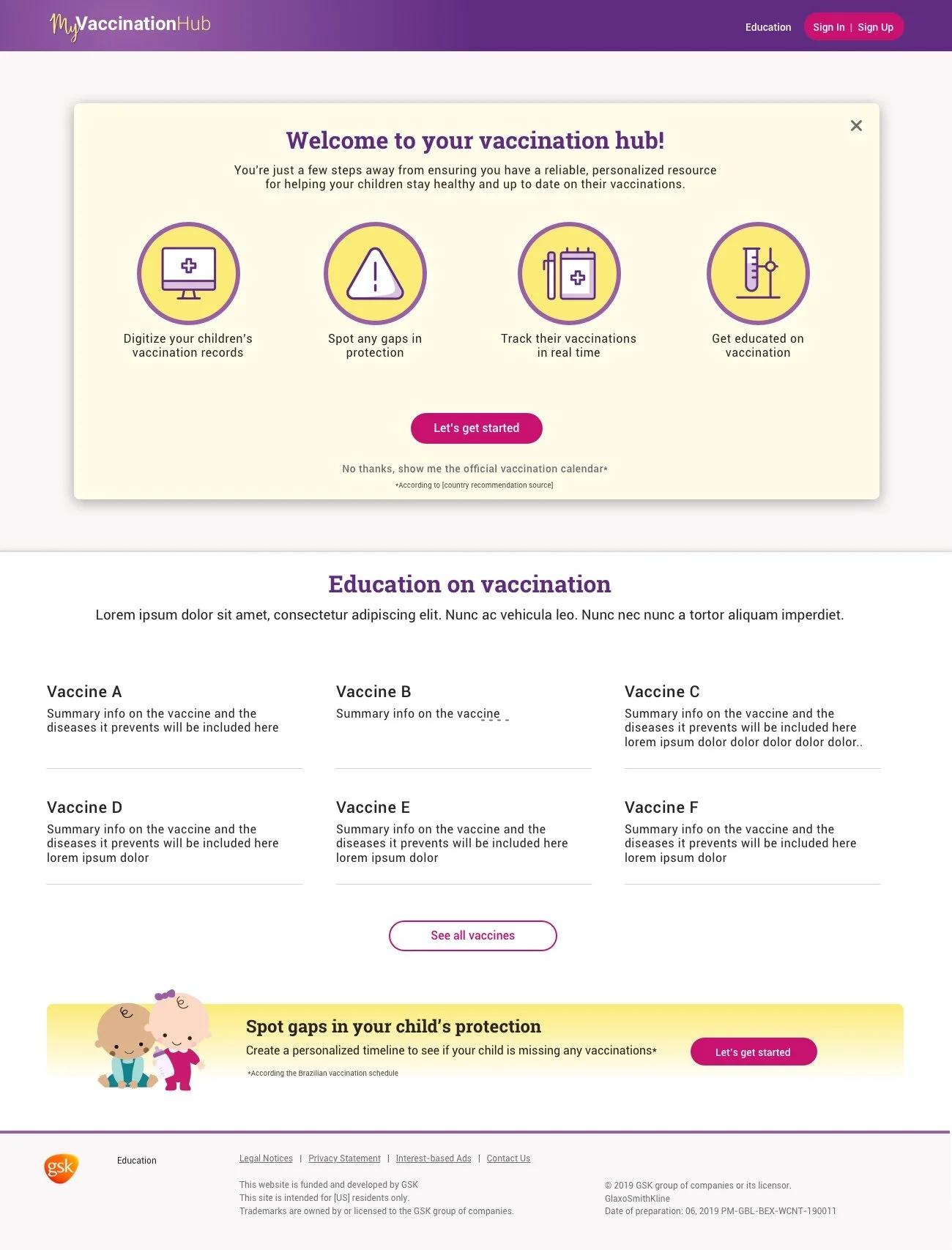
MOCk Ads
We created a potential in-app ad for Baby+ to promote the MyVaccinationHub integration.


Final Thoughts
This was one of my first projects tackling global rebranding while integrating into Baby+ without confusing existing users. Scope and budget limited UX updates since we used a WebView, but I’m proud of design decisions that addressed accessibility and offered branding options with a more child-friendly look. A future native app could expand these improvements further.